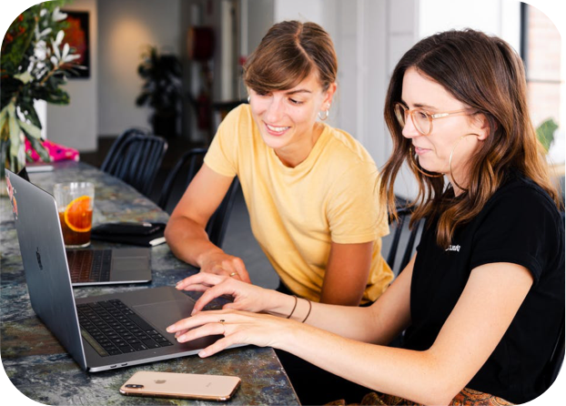

Robotica is a fictive client that we used for a project in the first year of the BSc Communication & Multimedia Design. Robotica is a festival in The Hague about the future and technology. During a period of roughly 10 weeks, I had created a brand and a lot of branding applications . For me, this wasn’t just a school project. I evenly put effort in all projects, whether it’s for school or for real clients.
• logo design
• google banners
• printed posters
• advertisement for a magazine
• mobile-only website
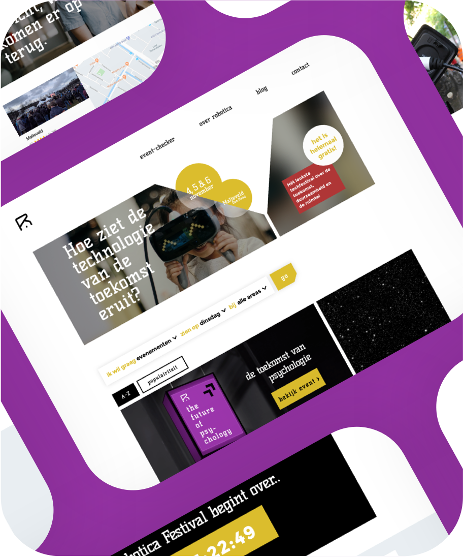
• desktop-only website
My goal with the logo was to create something extraordinary. I wanted to stay away from cliches like ‘gear’ icons and actually icons in general.
A lot of the students think the letter R stands alone very well. It would represent power and confidence. When looking at it from a more abstract perspective, there’s something not to miss. The lower part shows a house or tent if you put a rectangle on the base line. Also, the top part could be associated with a flag rising to the top right corner. All these elements could be seen at the festival itself too. A monospace font is associated with future and technology. The house/tent and the flag are also best visible with a monospace font.
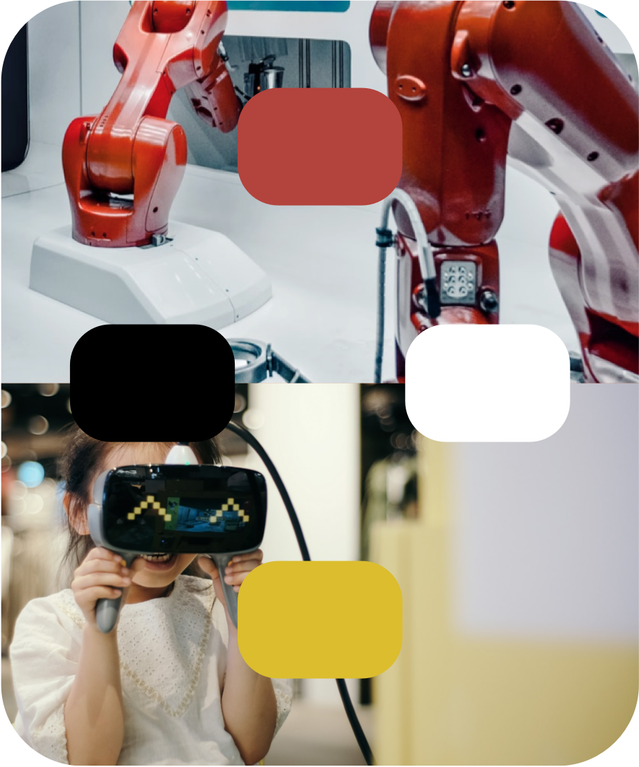
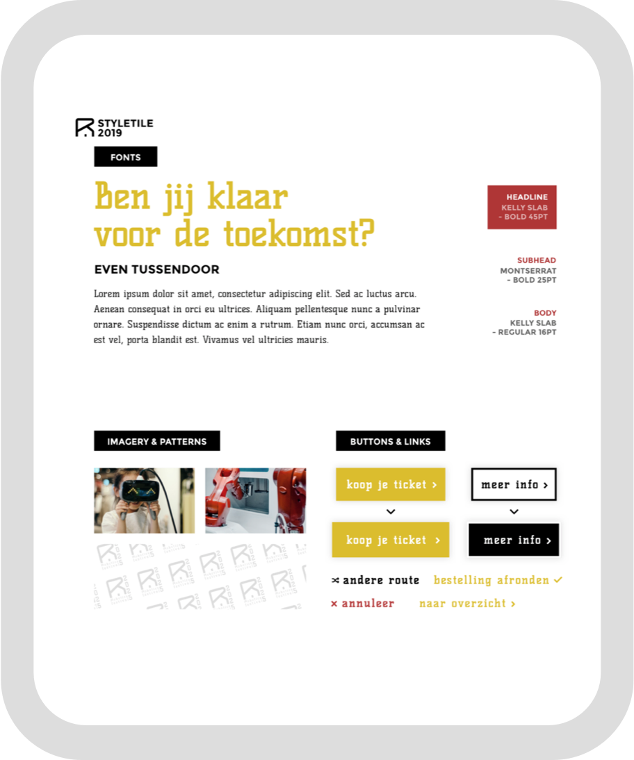
The images on the right are a representatation of the brand. The robot image is an obvious choice if you want to show technology and the future, but I wanted to have a human factor in it too. Relative to each other, yellow and red have a strong contrast and together with black and white they form a nice palette.
The heavy contrast, the monospace font and sharp edges in buttons and icons combined, create a strong, brand. This direction should be continued in all other applications that are coming later, for consistency.
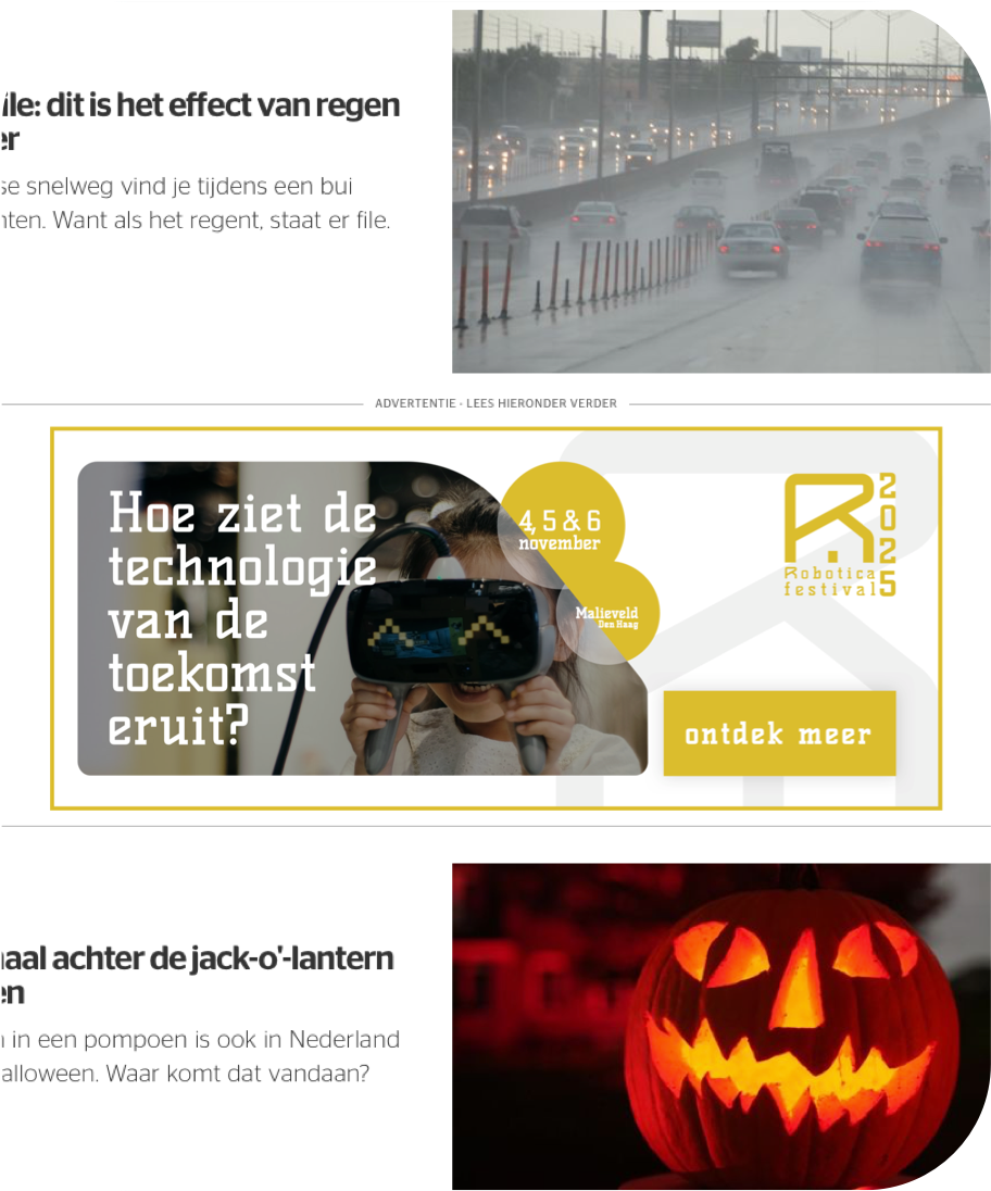
A set of banners was created to promote the festival online. The image on the left here visualises how such banners would look on a real website. The important principles that I referred to are the heading and the shape of the image. The set of banners all have a question as heading to arouse curiosity. Your eyes are automatically led to the call to action due to the shape of the image that ‘bends’.
A small research I did among fellow students showed that the main need of people visiting the festival is the experience of ‘wayfinding’. Since no-one carries a desktop with them, this concept should live on your mobile device. It caters for users that are having trouble finding their way through halls & tents at the festival.
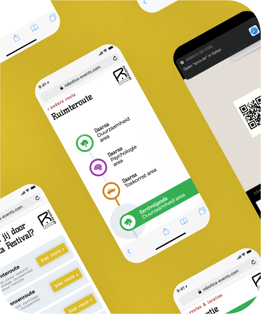
When sketching out the mobile concepts for on the go, I found out that one of them actually works better in a home context where people want to gather information prior to the festival. A usable design (obviously) shows different tents, stages and halls on different dates with the event checker. At the same time, users can ask their questions on the contact page and also find the fastest route to the festival.
Working at various artworks for prints & web design for Robotica Festival was very fun to do. Creating the whole image of a brand from scratch increasingly inspires me to create more of this.
Although this project was a school project with a fictive client, I passed the branding phase with a 9/10 and the web design phase with a 10/10. (BSc Communication & Multimedia Design, The Hague University).
Want to see the full design of this project? Reach out