


discoveryourflow is an inspiring coaching company with personal development, career development, behaviour-styles and drives and happiness at work being their focus points. The project started in 2017 and the website went live in the early months of 2021. Together, we want to create a visual identity for this brand, a functional and informative website to promote his services and some promotion material like social media templates and business cards.
• full visual identity
• visualising models
• business cards and invitations
• social media templates
• full website design and development
This phase of understanding the target audience actually took the majority of the time of the project. This is a good thing because getting to know your audience is something very valuable especially in the startup stages of a business.The ideal customer that wants to do a personal development coaching would be the individual freelancer or employee. This is different for other types of coaching discoveryourflow offers. For example: the ideal customer of a happiness-at-work-coaching would probably not be an individual but a team within an organisation. So how do you create a consistent brand identity with a website for multiple audiences?

This client's favourite colour is purple, or as they like tocall it ‘purper’. They told me that they were in possession of one report that matches colours with your personality that they like to stick with. The colours represent words like inspiration (turquoise), entrepreneurship (purper), influential manner (‘ocher yellow’) and a visionary (indigo / blue). Did you notice the slight difference between the left and right block of colours? We slightly tweaked them for a fresher and brighter look (for the web).
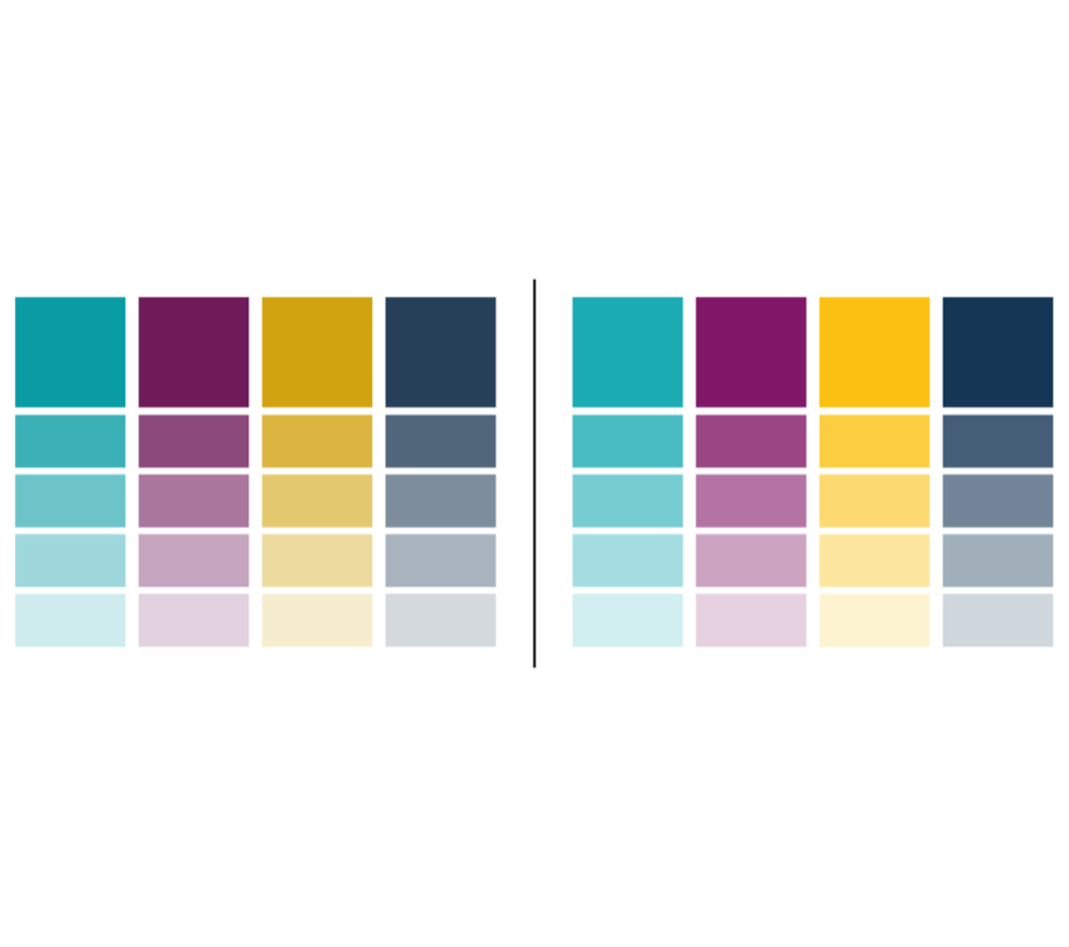
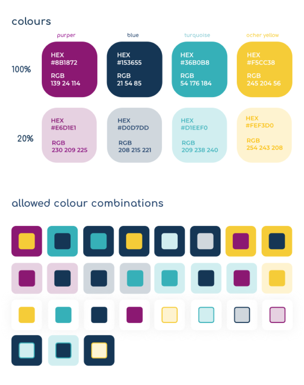
In the end we created a palette based on the four main colours and a 20% transparent version of it. During the process of combining colours, we figured that some colours really don’t match when used in a combination, so we set up rules about which colour can, but more importantly cannot, be combined. For example, all 20% colours cannot be used in combination with each other and yellow text is not allowed to go on a white background (less contrast, less visible).
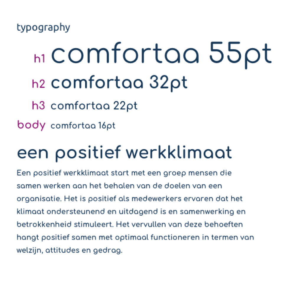
You might have noticed already, for the project we wanted to create visual elements with rounded corners. Rounded elements are playful, informal, transparent and accessible. We wanted to extend this direction to the font. ‘Comfortaa’ is the most round font we could find that is easily implementable (cause it’s a Google Font). To really aim for an informal style, we chose to have the headings in lowercase both on website and on every other branded product.
With the brand we wanted to have a very approachable, casual, transparent and positive tone of voice.
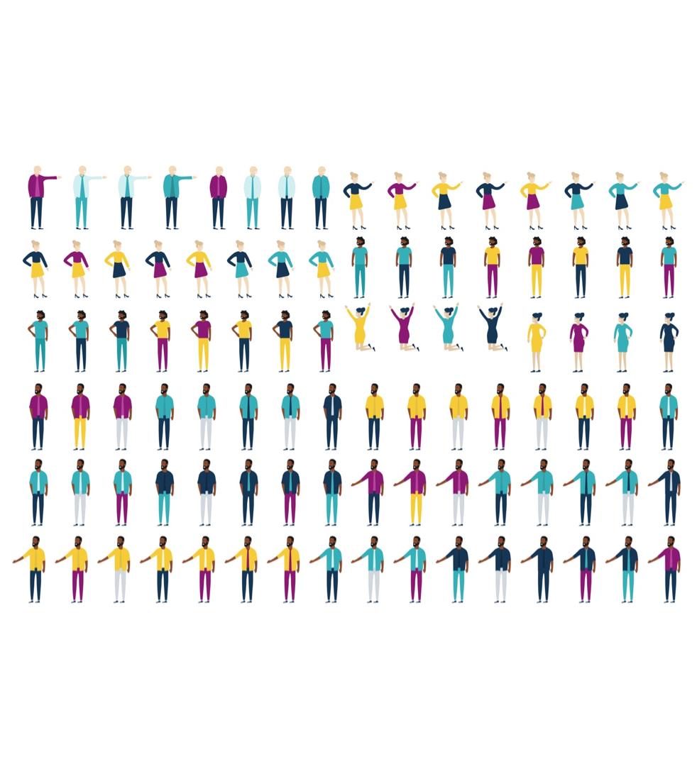
A picture says more than 1000 words, everyone knows that. We decided that this should be the way forward to communicate low-context and with positive vibes. Though, we did keep one thing in mind. The spectrum is very wide, meaning the colours we chose are pretty standalone colours. In our way of designing we keep things simple , minimalistic and structured (cause less is more). For us, the focus points regarding the style of characters were portraits, human in action, inclusivity and soft shapes. We created a large range of characters in all shapes and sizes for diversity and with the ability to use the right combination of characters to communicate a specific subject like ‘happiness at work’.
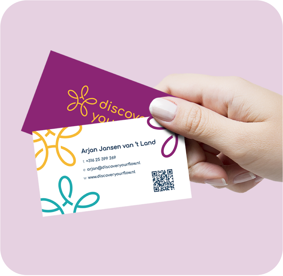
During the process of creating a visual communication style for the brand, accessibility has always been a main focus point. Keeping things simple but/thus beautiful. With the business cards we did the same thing. The front has the logo in yellow on a purple background (favourite combination) and the other main colours on the back in the form of logos. Even more accessible is the qr-code that leads you to their website.
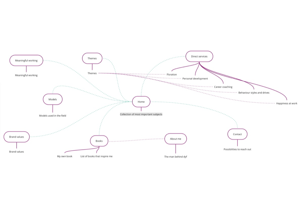
Now that we have the final version of the brand style ready, it’s time to focus on our specialisation: the website experience. Here’s a mindmap of the sitemap we created for the website with the ideal retention between pages. For my dad, inspiring people is one of his core drives. To create a website that translates that, we came up with three ways of doing it: themes, books, models.
A large range of themes was created all with a connection to one of the five services as well as a page of inspiring books and models used in the field during coaching sessions.
Together, we created a strong visual identity for the brand as well as a website experience full of bright colours and value through the content with the inspiration-pages. We’ve been working on this from 2017 and I’ll keep working closely together for the coming years in the role of creative director for discoveryourflow.
View the website live here.
