

March, 2021
collaboration: -
project by: Stichting Aldfaers Erf
Aldfaers Erf (Grandfather’s Yard) (former Het Friese Museumdorp, the Frisian Museumvillage) is a characteristic mound village once labelled as one of Holland’s finest spots. A picturesque small village just underneath the Afsluitdijk in Allingawier. With a restructuring of the yard and facilities, the foundation wanted the help of uniq.design to recreate a new visual identity and website for their new name.
- logo recreation
- new visual identity
- full website design and development
- technical support
The reason why the client wanted to do a rebranding is because they changed their foundation name from ‘Het Friese Museumdorp’ to ‘Aldfaers Erf’. In combination with a slight change of facilities on the yard the client figured it was time for a new visual identity and thus a new logo.
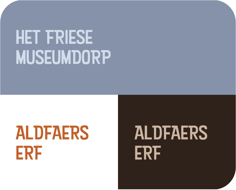
The old logo consisted of three colours: lavender-ish, brown/beige and red. We wanted to keep some elements the same so people still recognise it, even while the name has changed. That is why we chose to keep the same colours, but we tweaked the brown colour to look warmer and more playful in a way. We increased the amount of red in the logo relative to the old one and made the ‘pompebled’ (heart-icon) more prominent now being part of the logo instead of being part of the text.
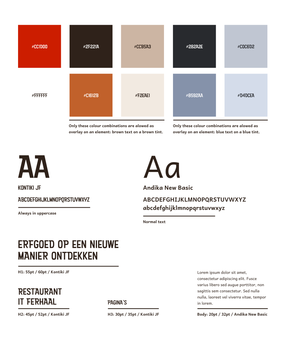
Together with the main colours in the logo, a strong visual identity has a largely filled palette. We added several tints of brown for background colours and also some extra tints of blue. These tints are to be used only in combination with their main colour so tints of blue with tints of blue and tints of brown with brown. This is because when merged, they fall out.
The type consists of one font for headings, and one for body text. The heading font is simply the font used in the logo, so that creates a nice consistency throughout all the branding. This font is only legible on great scale, so to make sure smaller paragraphs are actually readable, we introduced the body font to the brand style.
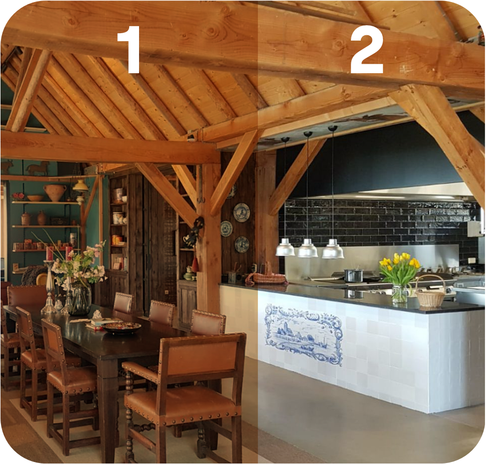
The colours of the logo have gotten warmer in contrast to the previous logo. We wanted to extend this pattern to the imagery / photography. See the difference in the image between part 1 and 2? The left side illustrates the warmer colour that every photo or film contains as an overlay. Like this, all images used on the website look consistent.
* tint extra overdone for illustration purposes
With the branding now finalised, it was time to brainstorm about the structure and architecture of the website. This was actually one of the main goals the client came up with. In their opinion “the website has too many clicks” meaning the website having too many pages and links with unclear meanings. I think I can say that this was surely the case and with the new website we brought the amount of pages from 44 back to just 9.
We combined information and grouped it together on pages with similar subjects. We now have a home page (duh), a location page, an activities page, an about page, a contact-page and a foundation page.
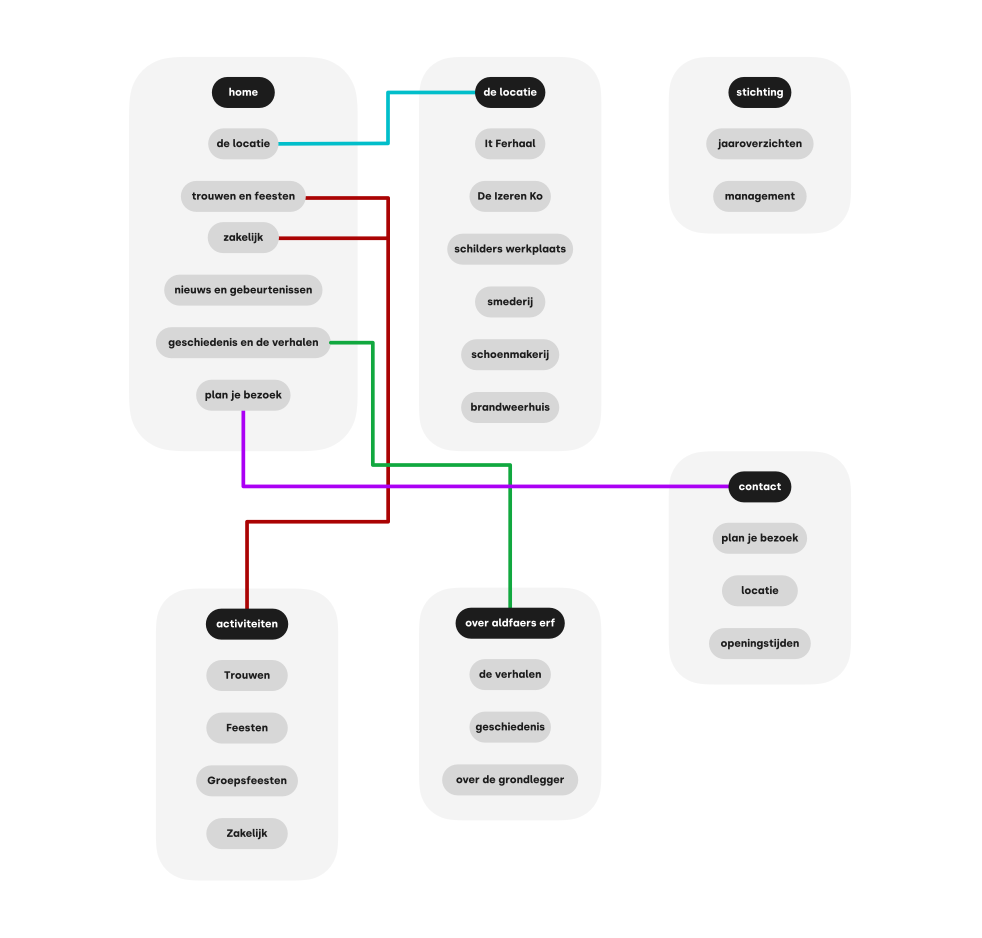
Now that we have the final version of the brand style ready, it’s time to focus on our specialisation: the website experience. Here’s a mindmap of the sitemap we created for the website with the ideal retention between pages. For my dad, inspiring people is one of his core drives. To create a website that translates that, we came up with three ways of doing it: themes, books, models.
A large range of themes was created all with a connection to one of the five services as well as a page of inspiring books and models used in the field during coaching sessions.
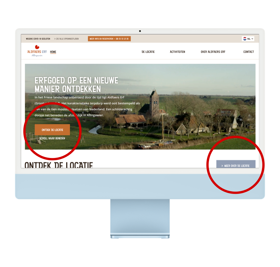
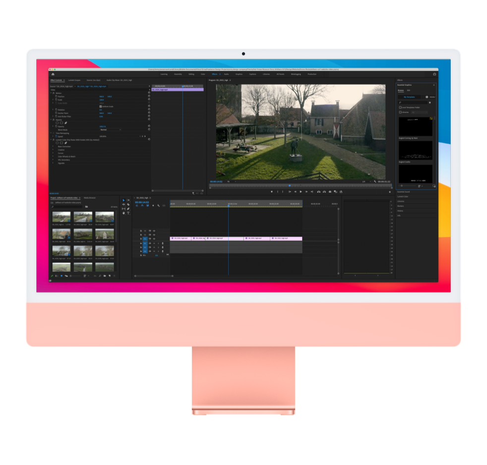
As mentioned before, we want users to experience what Aldfaers Erf looks like in real life. Film is a very nice and effective way to achieve such experience on websites. From more than 50 shots, we chose the best 5 and edited them into a nice short film in Premiere Pro.
It’s the first thing you see when you land on the website to grab the user’s attention. When you navigate to the location page, you’ll again see the video at the top of the page (makes sense on this page right?).
In the period of spring 2021, we created a fresh and colourful visual identity for the brand as well as a website experience that reflects Aldfaers Erf’s yard in real life.
View the website live here.
